

Data is a powerful tool—but only when it’s fully understood.
In today’s fast-paced business world, data isn’t just about numbers; it’s about making meaningful connections—both internally within your team and externally with your target audience.
Internally, data serves as a foundation for strategic conversations, guides sales and marketing alignment, directs campaign optimization decisions, and informs executives and other internal stakeholders on campaign progress and results. Externally, presenting data to your audience isn’t just about showcasing statistics; it’s about building trust and rapport. When you compellingly present data, you don’t just share information—you create an emotional connection. After all, while people may forget the specifics of what was presented to them, they’ll remember how it made them feel. This is where data visualization comes in. By tapping into the power of visual storytelling, you create lasting impressions that engage both your team and your audience on a deeper level. Data visualization isn’t just about making your numbers look good—it’s about creating impact that lasts.
In this blog, we’ll explore why B2B marketing teams should embrace a data visualization strategy and how it can elevate both internal decision-making and external engagement.
What is Data Visualization (What it is Not)
Data visualization is the practice of transforming raw data into graphical formats like charts, graphs, dashboards, and infographics to make it easier to understand and interpret. By presenting data visually, it allows users to quickly grasp important information and identify patterns, trends, and insights to make more informed decisions.
For marketers, data visualization helps teams track key performance metrics, understand consumer behavior, and optimize strategies—all while enhancing communication with stakeholders by presenting data in a digestible and engaging format. This helps ensure that everyone is aligned, making data-driven decision-making and ABM measurement faster and more effective.
However, data visualization isn’t simply about making data look visually appealing or creating charts for the sake of it. More than just flashy graphics or overwhelming visual elements, effective data visualization requires thoughtful design, where the primary goal is clarity and meaningful storytelling. It is also not a substitute for accurate data analysis or critical thinking—visualizations are tools to communicate insights, not to obscure or distort the underlying data. Without careful consideration, visualizations can mislead or misinterpret data, making it essential to ensure that the visual representations are both accurate and relevant to the story being told.
Beyond internal reporting, data visualization also strengthens external engagement. You can leverage compelling visuals in industry reports, thought leadership content, and first-party research to communicate insights effectively to prospects and customers. Clear, data-backed storytelling builds credibility, increases engagement, and helps complex information resonate with audiences. Whether used for internal strategy or external marketing materials, strong data visualization turns raw numbers into a compelling, impactful narrative.
Why B2B Marketers Need to Care About Data Visualization
You and your marketing team should care about data visualization because it’s a better way to communicate marketing’s efforts and successes versus shoving large datasets into a report. Data visualization is more than just a design choice—it’s a way to speak a common language across your organization. Different stakeholders process information differently; while some prefer detailed reports, others need quick, visual insights to make informed decisions. Well-crafted charts and graphs provide a clear, accessible way to analyze trends, track campaign performance, and guide strategic conversations.
For sales, it might mean visualizing pipeline trends. For customer success, it could highlight customer expansion and retention patterns. Product teams may need data on feature adoption, while the C-suite focuses on revenue impact. When used effectively, data visualization enhances data collaboration and decision-making. But poorly designed visual representations—or incorrect data—can mislead teams, causing confusion instead of clarity. The key is to ensure accuracy and relevance, so insights drive action, not distraction so you can get back to creating the best account-based marketing campaigns quickly.
Implementing a strong data visualization strategy doesn’t just improve internal decision-making—it also enhances external engagement. Whether through infographics, interactive reports, or social media content, visual storytelling makes complex data more digestible, increasing audience engagement and reinforcing your brand’s authority in the market. By presenting insights in a clear and engaging way, you can spark conversations, drive shares, and position your company as a go-to resource in your industry.
Data Visualization Applications for Marketers
Data visualization plays a key role in helping B2B marketers analyze performance, optimize campaigns, and communicate insights effectively. From tracking website traffic to presenting marketing results to stakeholders, visuals make data easier to understand and act on. Below are some key applications we see in B2B marketing data visualization strategies:
- Slide Decks – Used in sales presentations, product marketing onboarding, and stakeholder updates to showcase key metrics and insights.
- Board Decks – Executive-level reports often include bar graphs/bar charts, pie charts, line charts, Gantt charts, scatter plots, and trend visualizations to present marketing performance.
- Account Activity Tracking – Visualizing engagement across campaigns and the website (e.g., GA4 cohorts) to measure account-based interactions.
- Website Activity Analysis – Tools like GA4 help track user behavior with path exploration, key events, and custom reports on traffic views, users, and sessions to refine content strategies.
- Infographics – Engaging visuals for sharing industry stats, research findings, and thought leadership content.
- Dashboards – Internal tools like HubSpot, Google Search Console, and Tableau provide real-time campaign tracking and performance insights.
Other popular data visualization tools for B2B marketers include Excel, Google Looker Studio, GA4, Tableau, Databox, Salesforce, and Zoho. Platforms like Power My Analytics and Supermetrics help integrate data from social media and ads for enhanced reporting.
For external-facing data visuals, marketers can use Canva, Venngage, Infogram, and Piktochart to create engaging infographics, industry reports, and social media graphics. These tools offer templates and customization options that make complex data more digestible for broader audiences.
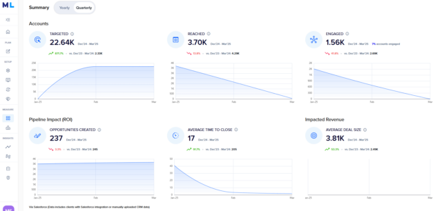
Additionally, marketing automation platforms like Marketo, Eloqua, Salesforce’s Marketing Cloud Engagement, and HubSpot offer built-in visualization tools for campaign and lead tracking. Customer relationship management (CRM) systems like Salesforce and HubSpot give you deeper insight into leads, accounts, and pipeline activity. You can easily integrate these solutions with the ML Platform to measure the effectiveness of your ABM programs with clear visibility into account engagement, pipeline influence, and deal velocity. Our platform includes sharable visuals to demonstrate data and insights, such as this screenshot here:
By leveraging these applications and integrations with an ABM solution like ML Platform, marketers can turn data into actionable insights, making it easier to optimize strategies and align with business goals.
Data Visualization Best Practices for B2B Marketers
Effective data visualization goes beyond just creating graphs—it’s about ensuring clarity, relevance, and actionable insights. Here are key best practices to follow:
- Define Your Metrics First – Before setting up a visual or working on visual elements, identify the specific metrics you need to track. This ensures your visualization aligns with your goals.
- Ensure Data Relevance – Only present data that is meaningful to your audience. Avoid unnecessary or unrelated metrics that don’t contribute to decision-making.
- Prioritize Clarity and Readability – Your visualizations should be easy to interpret across teams. Use clear labels, appropriate formats, and avoid clutter to ensure insights are accessible to all stakeholders.
- Focus on Actionable Insights – A graph alone isn’t enough. Analyze the data, extract key takeaways, and provide recommendations that connect to ABM KPIs like pipeline growth, sales performance, or engagement metrics.
- Tailor Visuals for the Audience – Internal reports may require detailed dashboards, while external marketing materials—such as industry reports, blog posts, or social media graphics—should focus on high-impact insights with minimal complexity. Choose the right format for each use case.
By following these best practices, B2B marketers can create data visualizations that drive informed decisions and meaningful conversations across their organization.
Trust the Quality of Data that Fuels Your Data Visualization
Not all B2B marketers are data scientists and data analysts—we can help you make sense of the most complex data sources. The ML Platform makes it easy to transform complex marketing data into clear, compelling visualizations. With seamless integrations across your key marketing channel mix, CRMs, marketing automation platforms, and LinkedIn, you can quickly generate dashboards that highlight key insights—no manual data crunching required.
The ML Platform streamlines tracking for pipeline performance, campaign impact, and audience engagement with intuitive reporting and automated data syncing. Spend less time on data preparation and more time optimizing strategies that drive revenue.
Ready to build smarter, more impactful ways to visual data and share business intelligence? See it in action by requesting a demo today.

